How to make your HTML-links really stand out
10th March 2023 by Admin
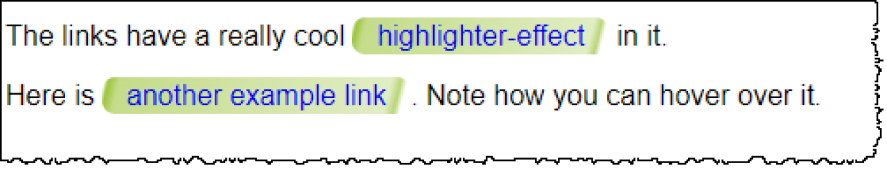
What do you think about the links on this page?

This looks like a real highlighter has been used on the text – very cool!
The idea presented in this post is just a write up of the CSS-techniques used on the Endless Paper’s Exhibit page. Amazing app by the way!
The whole HTML with inline CSS is shown below. Click on the image to see the original size.

Here is an explanation of what goes on.
- The HTML code creates two paragraphs that contain links.
- The CSS code applies styles to the links inside the paragraphs. The following styles are applied:
-webkit-animationandanimation: These properties apply a CSS animation namedhighlightto the link. The animation lasts for 0.5 seconds, with a delay of 0.75 seconds, and plays once in the normal direction before stopping (forwards). The-webkit-prefix is used to support older versions of Safari and Chrome.background: This property applies a linear gradient background to the link. The gradient starts with a transparent color at 0.45% of the gradient's length, then gradually becomes more opaque until it reaches 1.2% of the gradient's length, and then gradually becomes more transparent again. This creates the highlighter effect.background-size: This property sets the size of the background to be twice the width of the link, and the same height as the link.background-position: This property sets the initial position of the background to be at the right side of the link.padding: This property adds some padding to the link to ensure that the background does not bleed outside the link.-webkit-box-decoration-break: This property ensures that the background is broken properly when it spans across multiple lines of text (supported only by WebKit-based browsers).margin: This property removes any margin that may be present around the link.border-radius: This property adds some rounded corners to the link.font-family: This property sets the font family of the link to be "Helvetica Neue", Helvetica, Arial, or a generic sans-serif font.text-decoration: This property removes the underline from the link when it is not being hovered over.
- The CSS code also defines an animation named
highlight, which moves the background position from right to left, creating the highlighter effect. - The CSS code applies a different style to the link when it is being hovered over (
p a:hover). This style adds an underline to the link. - The CSS code also applies a style to the paragraph (
p), setting the font family to be "Helvetica Neue", Helvetica, Arial, or a generic sans-serif font.
If you would like to learn more about CSS animations, here are some useful resources:
- MDN web docs: https://developer.mozilla.org/en-US/docs/Web/CSS/CSS_Animations
- CSS-Tricks: https://css-tricks.com/almanac/properties/a/animation/
- W3Schools: https://www.w3schools.com/css/css3_animations.asp
The style-segment is coded like this:
p a {
-webkit-animation: 0.5s highlight 0.75s 1 normal forwards;
animation: 0.5s highlight 0.75s 1 normal forwards;
background: linear-gradient(104deg,
rgba(156, 196, 60,0) 0.45%,
rgba(156, 196, 60,1.25) 1.2%,
rgba(156, 196, 60,0.6) 2.9%,
rgba(156, 196, 60,0.3) 46.5%,
rgba(156, 196, 60,0.7) 48%,
rgba(156, 196, 60,0) 49%);
background-size: 200% 100%;
background-position: 100% 0;
padding: 2px 13.7px;
-webkit-box-decoration-break: clone;
margin: 0;
border-radius: 7.5px;
font-family: 'Helvetica Neue', Helvetica, Arial, sans-serif;
text-decoration: none;
}

@-webkit-keyframes highlight {
to {
background-position: 0 0;
}
}

@keyframes highlight {
to {
background-position: 0 0;
}
}

p a:hover {
text-decoration: underline;
}

p {
font-family: 'Helvetica Neue', Helvetica, Arial, sans-serif;
}
Hope you like it!